A mobile-friendly website is essential for every aesthetic clinic. It’s not just about appearance; it’s about accessibility, professionalism, and growth. If your clinic’s website doesn’t perform smoothly on smartphones, you’re likely losing potential clients.
Here’s why creating a mobile-optimised website should be a top priority for your clinic.
Key Takeaways
A mobile-friendly website allows clients to find and book appointments easily on any device.
Optimising your site for mobile can improve your visibility in Google search results, particularly for local searches.
A well-designed, easy-to-navigate website builds trust and strengthens your clinic’s professional image.
Clients expect seamless browsing on their phones; a positive mobile experience encourages loyalty and repeat bookings.
A mobile-optimised website helps convert online visitors into confirmed appointments.
Enhancing Client Experience Through Mobile Optimisation
Most people now use their phones first when searching for services, including aesthetic treatments. For clinics, this means your website must perform flawlessly on small screens. If it’s slow or difficult to navigate, potential clients will leave quickly.
Mobile optimisation is no longer optional—it’s essential for attracting and retaining clients.
Seamless Navigation Across Devices
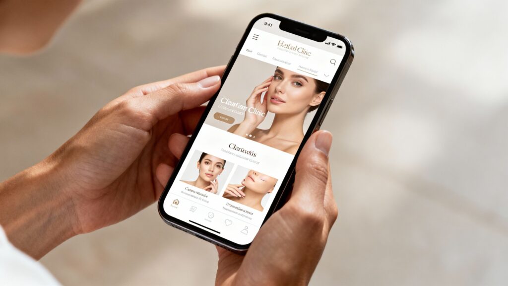
When clients visit your website on a phone, they expect to find information quickly and easily. Your site should look and function perfectly across all screen sizes—smartphones, tablets, and desktops.
Frustration with tiny buttons or unreadable text can cause visitors to leave. A well-designed mobile website allows clients to browse your treatments, pricing, and contact details effortlessly, creating a strong first impression of your clinic.
Intuitive Touch Navigation
Mobile visitors navigate with their fingers, not a mouse, so usability matters. Buttons should be large enough to tap easily, and menus should be simple and intuitive. Break long text into short paragraphs or bullet points so readers can scan quickly.
A site that feels like a well-designed app—with clear navigation and responsive elements—enhances the client experience significantly.
Streamlined Appointment Booking
Booking an appointment should be simple and seamless. If your booking system isn’t mobile-friendly, potential clients may abandon it. The process should allow users to choose a service, select a time, and confirm their appointment quickly.
Fewer steps mean higher conversion rates. When someone is ready to book, make sure they can complete it easily on their phone.
Boosting Clinic Visibility and Accessibility
Online visibility is as crucial as the quality of your treatments. A mobile-friendly website acts as your digital storefront—open 24/7 and always accessible. It’s not just about aesthetics; it’s about ensuring your clinic appears when potential clients are searching for your services online.
Improving Search Engine Rankings
Google prioritises websites that deliver an excellent user experience, particularly on mobile. A fast-loading, easy-to-read website is more likely to appear higher in search results. For searches like “skin clinic near me” or “botox in [your town]”, a mobile-optimised site improves your chances of ranking prominently—placing your clinic on the digital high street rather than hidden from view.
Leveraging Local Search
Most clients search for local services directly from their phones. Optimising your website for local SEO ensures your clinic appears when people nearby look for treatments. Keep your clinic’s name, address, and phone number consistent across your website and directories such as your Google Business Profile.
This strengthens your visibility in local search results and makes it easier for nearby clients to find and contact you.
Ensuring 24/7 Information Availability
Your website is like a reliable team member—available 24/7. It provides essential information about treatments, pricing, and location even when your clinic is closed. This accessibility allows potential clients to learn about your services at any time, keeping them engaged and informed beyond normal business hours.
Building Trust and Credibility Online
In aesthetics, trust is fundamental. Clients are making personal decisions about their appearance, so they must feel confident in your expertise. Your website is often their first impression—it should look clean, modern, and professional.
Avoid cluttered layouts or outdated visuals, which can undermine credibility. A polished, well-structured website conveys attention to detail and high clinical standards.
Showcasing Practitioner Expertise
People want to know who will be treating them. A dedicated section for your practitioners, complete with professional headshots and brief biographies, can make a huge difference. Highlight their qualifications, years of experience, and any specialisations they might have. This transparency helps demystify the process and reassures clients that they are in capable hands. It’s about showing the human side of your clinic and the depth of knowledge behind the treatments.
Client Testimonials and Galleries
Nothing builds credibility quite like the voice of a satisfied client. Incorporating genuine testimonials, ideally with photos or even short video clips, provides powerful social proof. Before-and-after galleries are also incredibly effective for aesthetic clinics. Seeing real results achieved by real people can be far more persuasive than any marketing copy. Make sure these are presented clearly and ethically, with client consent, of course. It’s a visual testament to the quality of your work.
Gathering Testimonials: Ask satisfied clients if they’d be willing to share their experience. A simple follow-up email after a successful treatment can work wonders.
Showcasing Results: Ensure before-and-after photos are well-lit, consistent in framing, and clearly demonstrate the treatment’s outcome.
Authenticity is Key: Use real client feedback and images; avoid anything that seems staged or overly polished, as this can backfire.
The Critical Role of Mobile in Digital Strategy
Understanding Mobile User Behaviour
It’s no longer a question of if your clients use their phones to find you, but how. The majority now turn to their smartphones first when looking for aesthetic treatments. This shift means your clinic’s digital presence must be designed with mobile users in mind from the very start.
Consider your own habits—when searching for a local business or checking opening times, you likely reach for your phone first. Your clinic’s online experience should match this behaviour.
The Impact of Mobile Experience on Reputation
Your website’s mobile performance is often a client’s first impression of your clinic. If it’s slow or difficult to navigate, it can make your business seem outdated, even if your in-person services are excellent.
A frustrating mobile experience may push clients elsewhere before they ever reach your booking page. On the other hand, a fast, intuitive mobile site immediately builds trust and reflects a modern, client-focused clinic.
Adapting to Evolving Digital Expectations
Client expectations are always evolving, shaped by everyday technology. People now expect instant access and seamless digital experiences. If your clinic’s website or booking system feels slow or outdated, it suggests your business isn’t keeping pace.
Staying relevant means ensuring your digital touchpoints are as polished and client-friendly as your clinic itself.
Optimising Content for Mobile Users
When visitors access your clinic’s website on their phones, they’re usually after quick information or to book an appointment. They don’t want to scroll through long paragraphs or wait for slow pages to load.
Clear, concise content is key to keeping mobile users engaged.
Think about how you use your phone to look up businesses. You want things to be clear and straightforward. Large paragraphs are a pain to read on a mobile device. It’s much better to break up your text into smaller, manageable chunks. Using bullet points or short, punchy sentences helps people scan the information quickly. This makes your website feel more approachable and less like a chore to read.
Bite-Sized Content and Readability
To make your website content work effectively on mobile:
Keep sentences short and straightforward.
Use clear headings and subheadings for structure.
Break information into bullet points or numbered lists.
Maintain white space to avoid clutter.
Choose font sizes that remain readable without zooming.
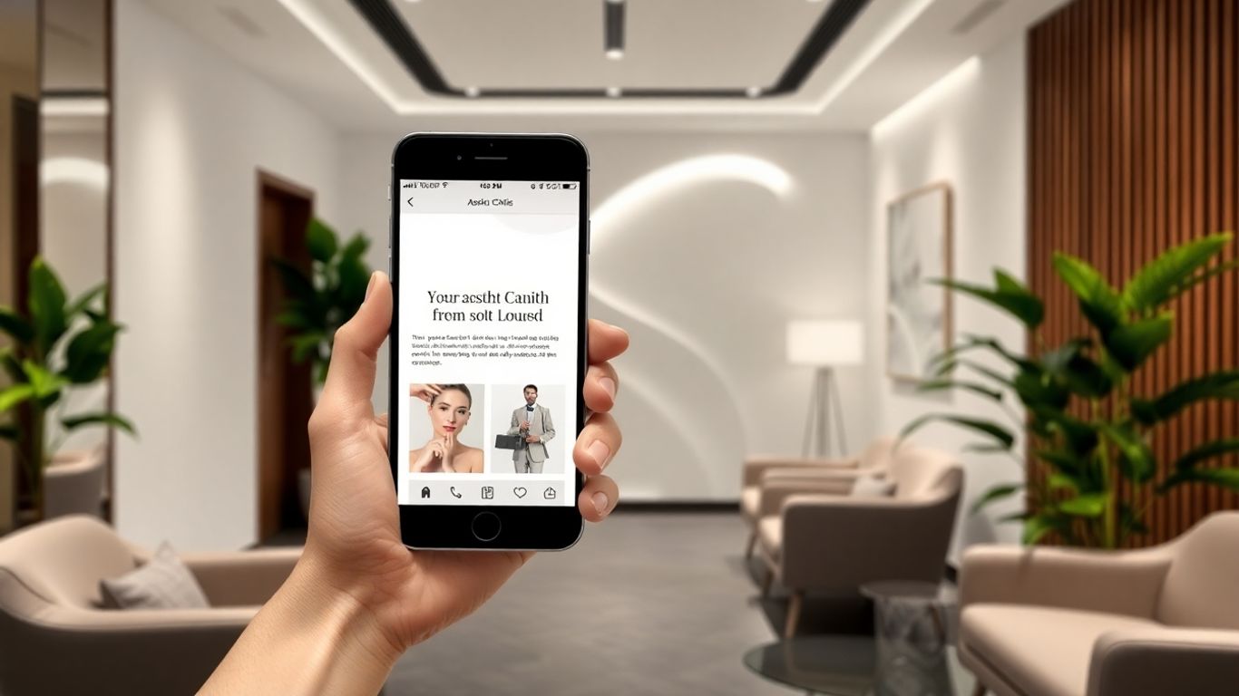
Optimised Images and Video Integration
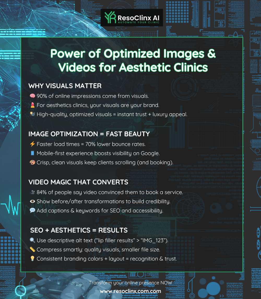
Images and videos can enhance your website, but they must be optimised for mobile. Large image files slow loading times, which can drive visitors away. Compress images to maintain quality while improving speed.
For videos, ensure they are hosted on a reliable platform and that the player adjusts automatically to screen size. Avoid outdated technologies like Flash, which no longer perform well on mobile devices.
Minimising Pop-Ups and Clutter
Pop-ups can frustrate users on mobile devices, often blocking content or navigation. Unless legally required (for example, cookie consent), avoid them. A clean, uncluttered design improves the browsing experience. Think of Google’s homepage—simple and focused.
Apply the same principle by keeping only what helps visitors find information or take action.
A mobile-friendly website isn’t just about looking good; it’s about making it easy for potential clients to find information, understand your services, and book appointments quickly and without frustration. Every element should be designed with the mobile user in mind.
Driving Conversions with Mobile-First Design
Ensuring your website performs well on phones is essential for turning visitors into clients. When people research aesthetic treatments on mobile, they want fast, straightforward navigation. If your site feels slow or awkward, they’ll quickly move elsewhere.
A professional mobile experience builds confidence and encourages bookings.
Clear Calls to Action
On mobile, your “Book Now” or “Contact Us” buttons should stand out.
Make them easy to see and tap, with clear contrast against your background. A simple, visible call to action guides clients to take the next step and helps increase bookings.
Efficient Contact Forms
Keep your contact forms brief. Mobile users prefer simplicity—ask only for essential details such as name, phone number, and a short message. You can collect more information later.
Shorter forms reduce abandonment and increase enquiries.
Converting Visitors into Consultations
Your goal is to convert website visitors into paying clients. The journey from browsing to booking should be quick and intuitive:
Visitors land on your site
They find treatment information easily
Clear contact or booking buttons guide them
They can book or enquire within seconds
Simplifying this path respects your clients’ time and increases conversions.
Making the entire process feel effortless on a mobile device is what turns a casual browser into a booked appointment. It’s about respecting their time and making it simple for them to take the next step.
Don’t Get Left Behind: Embrace the Mobile-First Future
Almost everyone relies on their phone for information and services. If your aesthetic clinic’s website isn’t optimised for mobile, you’re missing out on valuable opportunities. A mobile-friendly design ensures clients can find you, explore your treatments, and book appointments quickly.
It’s a smart, practical way to strengthen your online presence and help your clinic grow. Make sure your website is as welcoming and efficient as your clinic itself.
